Let's build an example on your Jupyter Notebook
To start in less than five mins, you can follow this working example line by line or simply copy-paste the code in your Jupyter Notebook.
Goal
For this example, we will explain a CatBoost Model that is predicting RiskPerformance from the HELOC dataset by FICO.
1. Install relevant packages
pip install catboost
pip install explainx
2. Import the library
from explainx import *
import catboost
3. Load Dataset
dataset = pd.read_csv('data/heloc_dataset.csv')

#Encode RiskPerformance. Good=1, Bad=0
map_riskperformance = {"RiskPerformance":{"Good": 1, "Bad": 0}}
dataset.replace(map_riskperformance, inplace=True)
4. Split dataset into X_Data & Y_Data
#Y_Data = Pandas Series
Y_Data = dataset.RiskPerformance
#X_Data = Pandas DataFrame
X_Data = dataset.drop('RiskPerformance',axis=1)
Train the Model
5. Initiate the training function
#Catboost Pool
test_data = catboost_pool = Pool(X_Data, Y_Data)
#Train the CatBoostClassifier
model = CatBoostClassifier(iterations=500,
                           depth=2,
                           learning_rate=1,
                           loss_function='Logloss',
                           verbose=True)
model = model.fit(X_Data, Y_Data)
6. Pass your X_data, Y_data, y_variable name, model and model name to the explainx function
explainx.ai(X_Data, Y_Data, model, model_name='catboost')
7. Click on the link to access the dashboard
App running on https://127.0.0.1:8050
After you click on the link, you will get a dashboard. Let's continue and see how we can analyze our dashboard for this example:
8. Explanation: Dashboard
After clicking the link, you will be able to access this dashboard. In the dashboard, you will be able to view your data and filter from within the datatable.
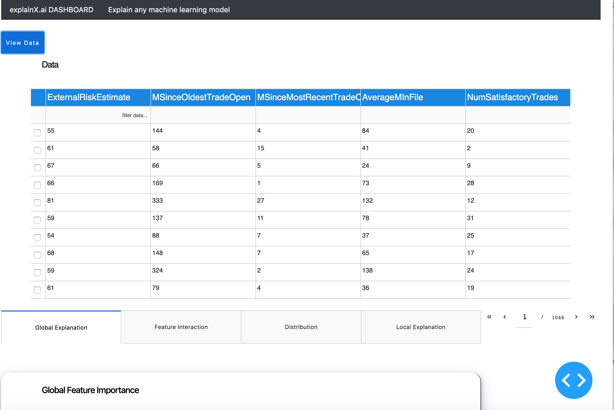
Below the table, you have four tabs that we will further explore.
1. Global Level Explanation
1.1. Global Feature Importance
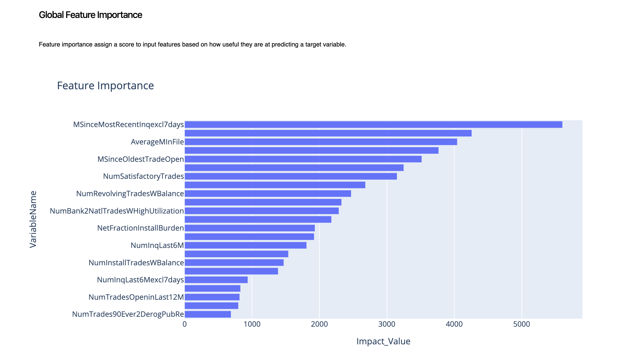
As we can clearly notice, MSinceMostRecentinqexcl7day, PercentTradesNeverDelq and AverageMinFile are top three high-impact variables. This gives us a general idea of what the model thinks our top variables are that we need to pay a special focus on.
1.2. Global Feature Impact
To dig deeper and figure out which variable has a positive impact on the outcome and which variable has a negative impact on the outcome, we look at the global feature impact.
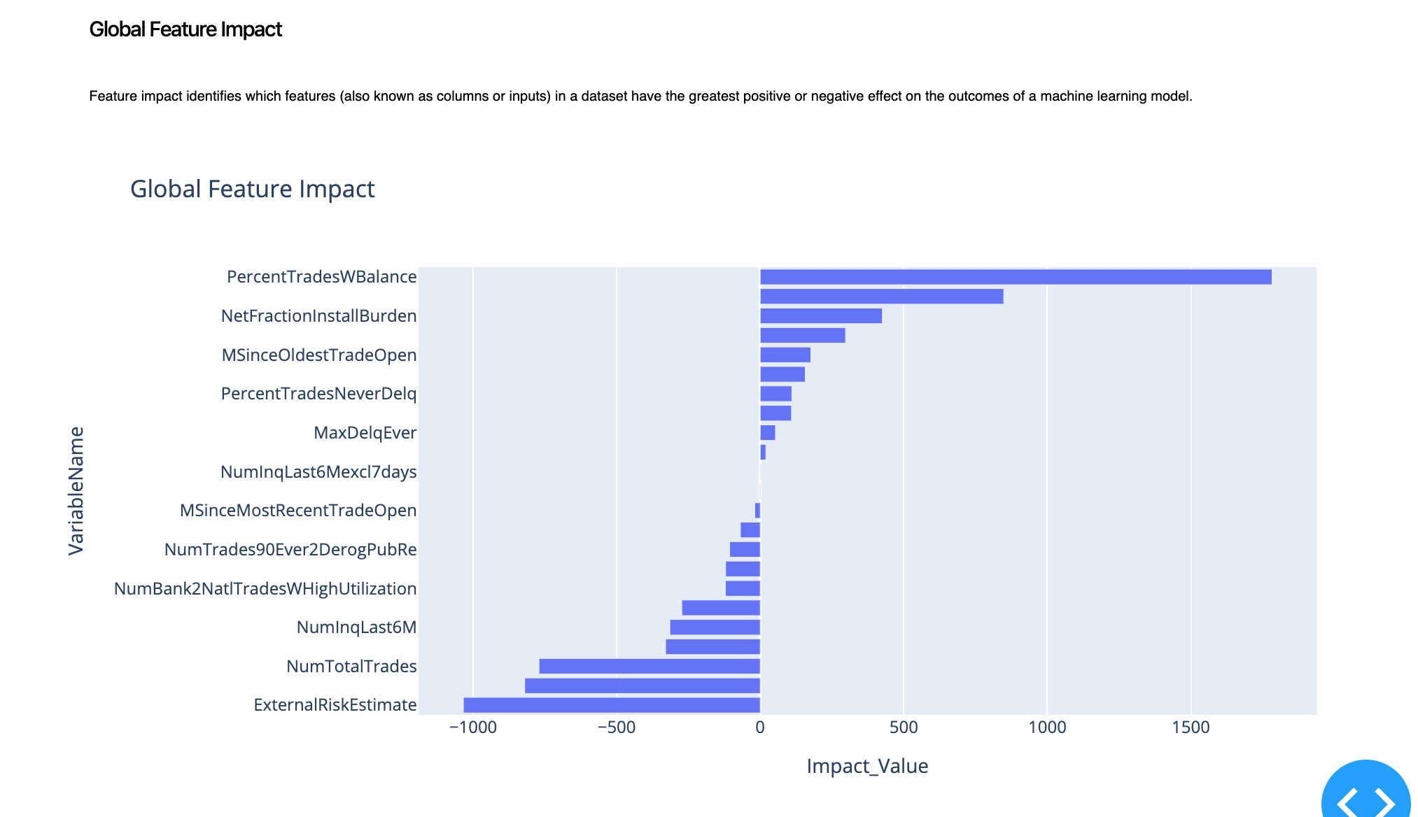
By looking at the graph above, we can understand that PercentTradesWBalance and NewFractionInstallBurden positively impact the prediction. This means that if the prediction is "Good" for a specific customer, these two variables will play a part in maintaining this prediction. But if we look at ExternalRiskEstimate, it has a negative impact which aligns with our intuition or our mental model. This means that if the prediction is "Good" and we increase the ExternalRiskEstimate, we will likely end up flipping-up the prediction to "Bad".
2. Local Level Explanation
Local level explanation enables you to explain a specific prediction point. By clicking on the local explanation tab, you can enter a row number that you want to explain.
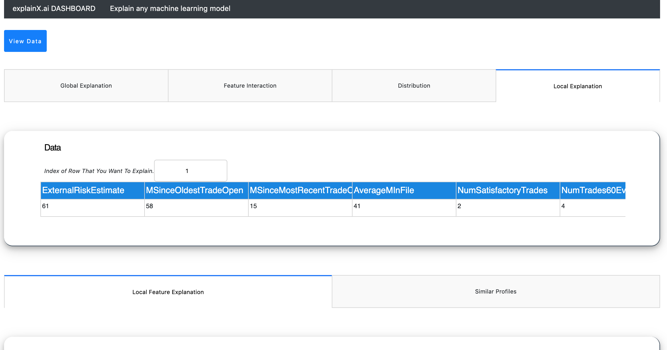
We will get explanations for row number 1.
2.1. Local Feature Importance
To begin with a simple feature importance will give us an overview of the model logic for this particular prediction point.
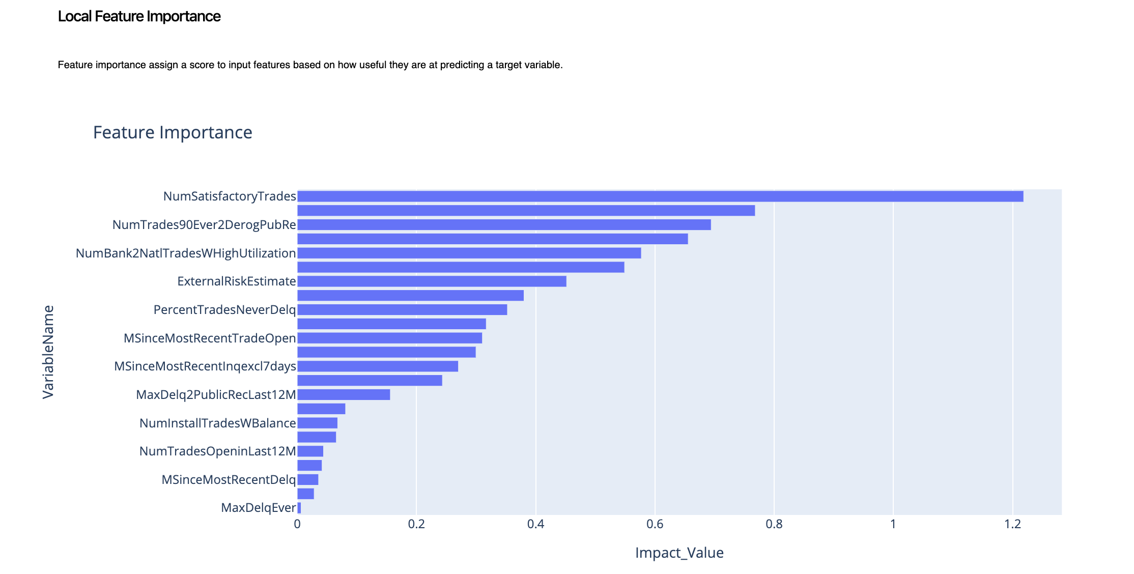
Here, we can see that the insights are very clear.
2.2. Local Feature Impact
To dig in further, we will again explore the feature impact. This will tell us the role each variable played to impact the outcome for that specific data point or row.
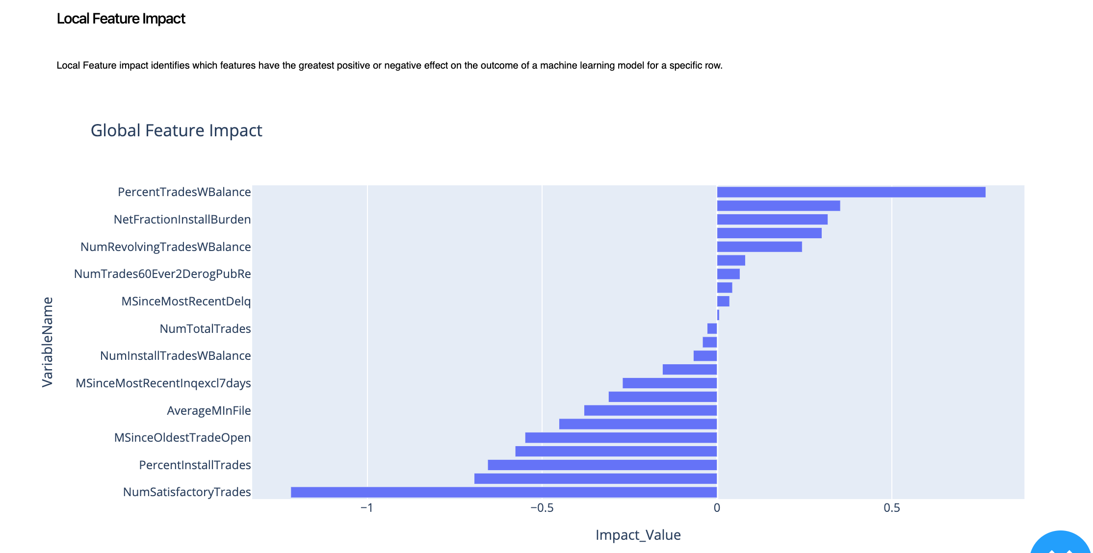
To summarize, we can learn that for this specific prediction point, PercentTradesWBalance had a positive impact on the outcome whereas NumSatisfactoryTrades had a negative impact on the outcome. This is also called the decision logic that the model took to arrive to a decision.
2.3. Similar Prototypes
Now to tie it all together, we introduce our prototypical analysis. For row number 1, we want more validation so we will identify five other profiles that have the same outcome/prediction as our sample/row number 1.
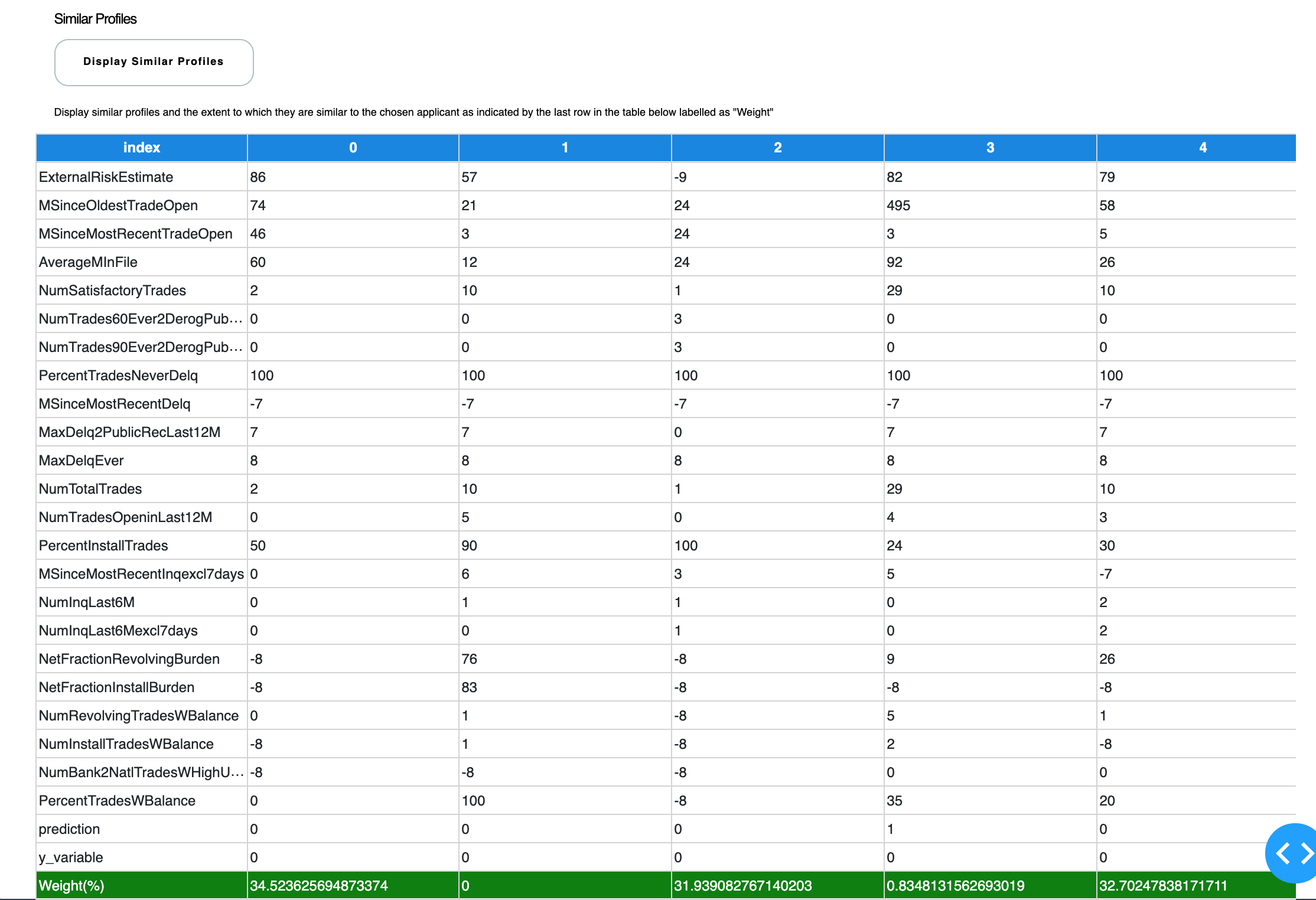
This is a great way of explaining to your business manager that because Profile A, Profile B and Profile C had very similar variables to our Row Number 1, therefore my machine learning algorithm predicted predicted a certain outcome.
In this case, Prototype 0 is 34% similar, Prototype 2 is 31% similar and Protoype 4 is 32.7% similar to the sample or row number 1 that we are trying to explain. Now business managers can comprehend how the machine learning model is making its decisions.
3. Scenario Analysis
Now, let's explore different scenarios and see how the model performs. We can apply ours data filters within the datatable (no need to write SQL queries to filter your data) and explain multiple instances and scenarios very easily.
This is extremely useful when you are trying to understand behavior on a specific cluster or group of data.
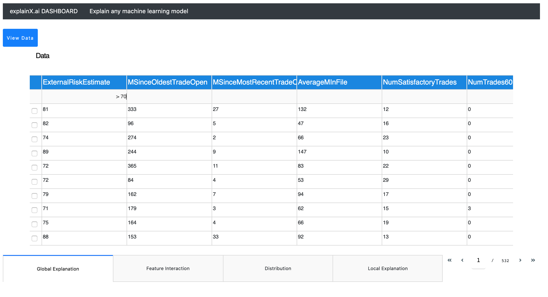
In this example, we can explore the model predictions where "ExternalRiskEstimate" was greater than 70. Just click on the filter tab and enter your query.
For string filters, start with "eq" as it associates an exact match. For example, eq 70 will return the dataset where ExternalRiskEstimate was 70. By using global level explanation and local level explanation, we can further strengthen our understanding.
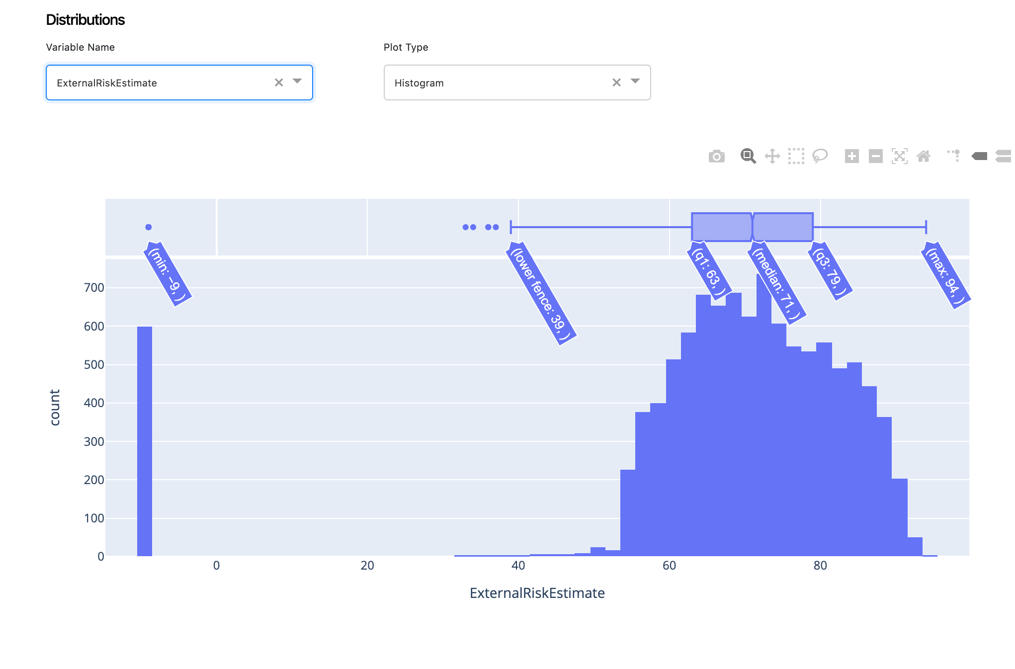
4. Distributions
Distributions are another great way of looking at data for identifying patterns, biases and imbalances within your dataset. ExplainX has a lightweight distribution generator. All you have to do is choose your variable and get its distribution.
4.1. Histogram & Violet Plots
Data Scientists can view histograms or violet plots, depending on your needs. You can easily get the mean, sd, IQR etc.
5. Feature Interaction
We will now explore the marginal effect one or two features have on the predicted outcome of a machine learning model.
5.2. Summary Plot
The summary plot combines feature importance with feature effects. Each point on the summary plot is an impact value for a feature and an instance.
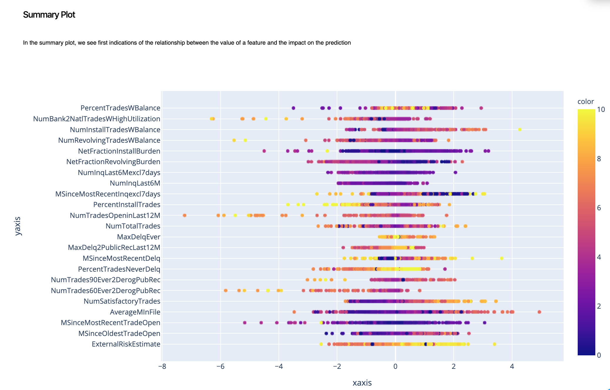
In this case, we can get a higher level view of how changing the value of each feature impacts the prediction.
5.1. Partial Dependence Plot
With PDP, we will dive in deeper to look at how changing ExternalRiskEstimate, changes the prediction.
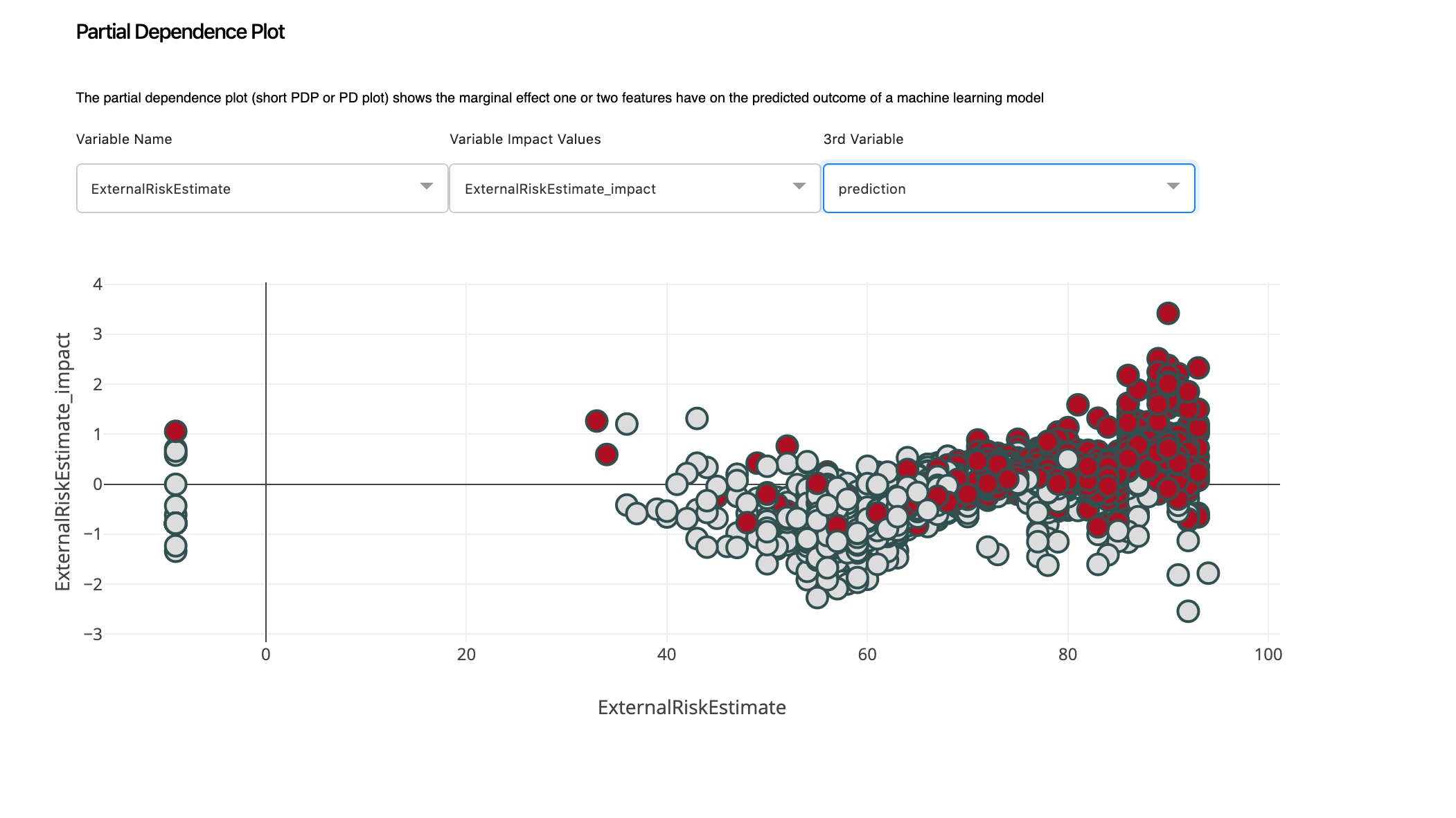
We can clearly spot a pattern here. When the value of ExternalRiskEstimate is between 40 and 60, we have Bad candidates. This is an interesting trend to explore that we easily can by simply choosing different variables from the 3rd Variable dropdown button. This will help us explore how features interact with each other and affect the overall prediction.
Conclusion
We clearly saw how intuitive and fast it is to explain a machine learning model in a very easy to use language with explainX.ai. We envision data scientists using this to identify patterns, explain the logic behind the model to their business counterparts and eventually make more accurate predictions.